

BLKD
Fitness Supplement Brand
BLKD, were looking for a quick, professional turnaround on their new fitness supplement brand. They required not only a new logo but also a packaging design to suit the new pre-workout product.

BLKD - Final Logo

BLKD - All Four Flavours
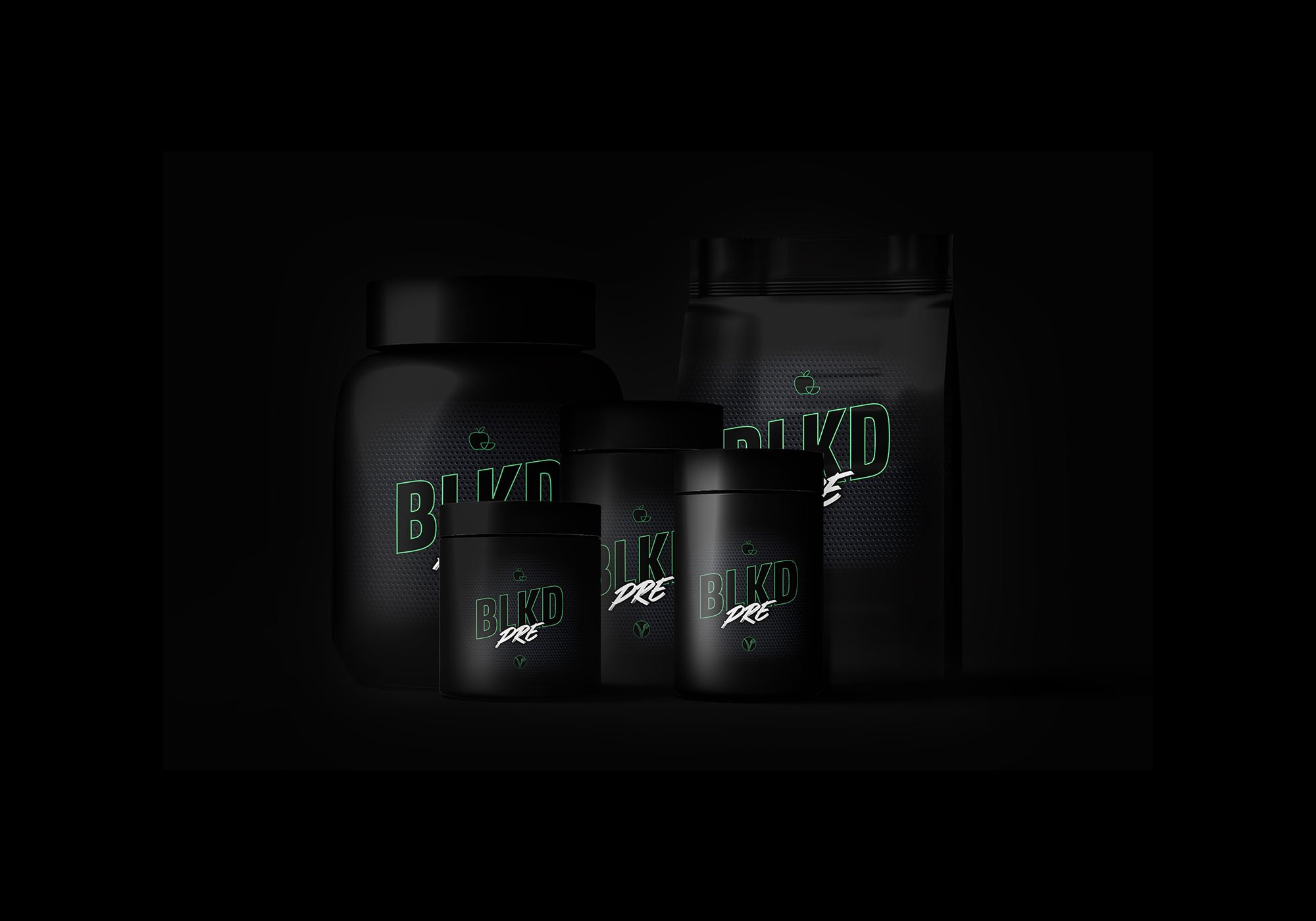
BLKD - Full Set of Apple Pre-Workout Products
“Thank you for taking direction and bringing our vision to life. Communication was great and would definitely use ZigZag again”
— Cleo Patterson Ramsey. BLKD.
Cleo had a clear direct idea of what they wanted at BLKD. They wanted a dark branding but with neon elements to show the energy, you would get from pre-workout. We took the brief on board and in doing so delivered a bright neon logo and a full set of packaging.
Alongside the neon logo, the concept was to have different colourways for each flavour; Apple, Cherry, Pineapple and Blue Raspberry. With this in mind, we created fruit icons for each flavour to keep the design minimalist and on-brand.
Getting the packaging right for this project was vital. The fitness supplement market is not only heavily saturated but there are some massive brands out there dominating the shelves of superstores and fitness marketplaces. BLKD are now ready to launch their product into the market and show why their pre-workout brand is better than the rest.
Creative Direction
Branding
Packaging Design